How to Match Outfits Like You Actually Know What You're Doing
Knowing how to match outfits sounds like it should be intuitive. You look at two pieces, feel whether they go together, and move on with your morning. But most people stand in front of their closet for longer than they'd like to admit, second-guessing every combination, and still walk out the door unsure.
You're not bad at fashion. You're just missing a framework. Once you understand a few basic principles - color relationships, pattern logic, texture layering, and proportion - matching outfits stops being guesswork and starts feeling like second nature.
Here's what actually works.
Start With Color: The Rules That Actually Matter
Color is where most outfit-matching questions live. And while the full color wheel theory can get complicated fast, you only need to know three relationships to cover 90% of real-world outfit decisions.
Analogous colors sit next to each other on the color wheel. Think rust, terracotta, and burnt orange. Or sage, olive, and forest green. These combinations feel harmonious because the colors share undertones. If you want an outfit that looks effortlessly put-together without trying too hard, analogous is your go-to.
Complementary colors sit directly across from each other on the wheel. Navy and orange. Purple and yellow. Green and red. These combos create visual tension - which sounds like a bad thing, but in fashion, tension means interest. The key is to let one color dominate and use the other as an accent. Cobalt blue blazer with a burnt orange scarf? Works. Equal amounts of each? Usually too much.
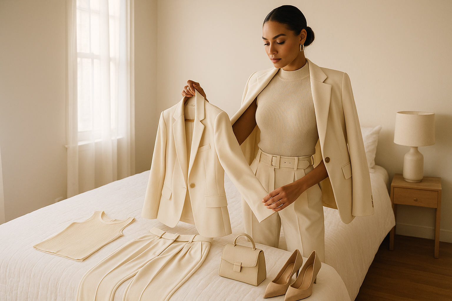
Neutral anchoring is the easiest approach of all. Build around one neutral (black, white, cream, gray, camel, navy) and let everything else play off it. Neutrals don't compete with each other, which means you can pile on texture, pattern, and accessories without the outfit falling apart.
One number to keep in mind: the 60-30-10 rule. Sixty percent of your outfit should be a dominant color, thirty percent a secondary, and ten percent an accent. It's borrowed from interior design, but it translates perfectly to getting dressed.
Patterns: How to Mix Without Making a Mess
Mixing patterns is the thing most people are afraid of. It looks either really good or really chaotic, and it's hard to know in advance which one you're heading toward.
The rule that makes it work: vary the scale, match the palette.
A large floral and a small stripe can absolutely coexist if they share similar colors. A large plaid and a medium stripe in the same color family will look intentional. Where people go wrong is pairing two patterns of similar scale in clashing colors - that's when it reads as visual noise rather than a style choice.
Texture counts here too. A fine-knit sweater with a subtle pattern reads quieter than a chunky knit, so the contrast between them matters less. Think of patterns existing on a spectrum from loud to quiet, and aim for variety across that spectrum within a single outfit.
If you want to start experimenting with pattern mixing without committing fully, try this: one printed piece, one tonal piece that pulls a color from the print, and one solid that grounds the look. Three pieces, clear hierarchy, no chaos.
Texture: The Dimension Most People Overlook
Color and pattern get all the attention, but texture is what separates an interesting outfit from a flat one. An all-black outfit in a single texture reads as boring. An all-black outfit in leather, silk, and chunky knit reads as intentional and elevated.
When you're thinking about how to match outfits, ask yourself whether there's enough textural contrast. This matters especially for monochromatic looks, where color contrast is intentionally minimal. Texture becomes the main event.
Some pairings that consistently work:
- Chunky knit with tailored trousers
- Sheer or satin with something structured
- Denim with something soft (velvet, cashmere, linen)
- Leather with flowing fabric
The general principle: balance weight. Heavy textures at the top can work if the bottom is lighter, and vice versa. Piling heavy textures on both top and bottom tends to feel stiff or overwhelming.
Proportion: The Silent Factor
Even when colors match, patterns work, and textures contrast nicely, an outfit can still feel off. Usually, the culprit is proportion.
Proportion is about the relationship between fitted and loose, long and short, wide and narrow. The classic rule is to offset volume: if the top is oversized, the bottom should be more fitted. If the pants are wide-leg, the top should be tucked or cropped.
This isn't about hiding your body or following some prescriptive silhouette rule. It's about visual balance. An outfit with volume everywhere loses shape. An outfit with fitted pieces everywhere can feel too tight or severe. The contrast between the two is what creates a look that feels considered.
One proportion hack that works in almost any context: tuck at least one piece. A tucked-in shirt, even a partial tuck, creates a waist and breaks the outfit into distinct zones. It's a small move with a large visual effect.
Shoes and Bags: Where Matching Gets Complicated
The old rule was simple: match your shoes to your bag. That rule is basically obsolete now. Matchy-matchy reads as dated; intentional coordination reads as styled.
The current approach is to connect rather than match. Your shoes and bag don't need to be the same color, but they should exist in the same visual universe. Both warm-toned, or both cool. Both matte, or both with some sheen. Or connected by a color that appears elsewhere in the outfit.
Metal hardware is worth thinking about too. If your bag has gold hardware, gold jewelry and shoes with gold details will pull things together without making the outfit feel costume-y. Silver with silver works the same way.
The one time exact matching still works: when you're going for a deliberately monochromatic or editorial look and the matching is clearly intentional rather than accidental.
How to Test a Look Before You Commit
This is where most style advice stops - it tells you the rules but doesn't tell you how to apply them in real time, when you're standing in front of your closet at 7 AM and genuinely unsure if what you've assembled looks good.
The honest answer is that seeing yourself clearly in the moment is hard. You're too close to the outfit, both literally and figuratively. Your eyes adjust to combinations the longer you look at them, which means your tenth look at a mirror is less reliable than your first.
One practical workaround: take a photo. A photo collapses the three dimensions of an outfit into two, which is how everyone else will see you. It also gives you something to compare. If you're deciding between two options, seeing them side by side as photos is dramatically easier than toggling between mirrors.
This is exactly what StylePal is built for. You upload two outfit photos, and the app gives you an instant AI-powered style rating with a breakdown of what's working. It's the equivalent of having a friend with a good eye who'll tell you honestly which of the two looks better rather than saying "they're both great." Free to download on iOS and Android.
Building a Framework You'll Actually Use
All of these rules work best when they become reflexes rather than calculations. The goal isn't to think through color theory every morning. The goal is to internalize the patterns well enough that you can move fast.
A few shortcuts worth keeping:
Build a neutral base in your wardrobe. If most of your pieces can pair with a neutral, you'll rarely end up stuck. Camel, navy, cream, and charcoal are the most versatile.
Know your contrast level. Some people look better in high-contrast outfits (very light and very dark together). Others look better in low-contrast (similar tones throughout). This is related to your natural coloring and is worth figuring out once.
Trust fit first. A well-fitting outfit in colors that are only okay will almost always beat a perfectly color-matched outfit in clothes that don't fit. Fit is the foundation everything else builds on.
Use the photo trick. When you're unsure, shoot it. Compare. Decide. You'll get faster at reading what you see.
Knowing how to match outfits isn't a talent. It's a skill, and like any skill, it gets easier the more you practice it consciously. Start with one principle - color anchoring, or proportion balance, or pattern scale - and apply it for a week. Then add another. After a month, you'll be combining them without thinking.